Up next in 10 CANCEL
PLAY NOW
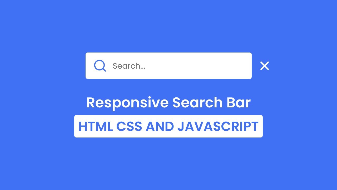
Make a Responsive Search Bar in HTML CSS & JavaScript In this video tutorial, you will learn how to create a responsive search bar using HTML, CSS, and JavaScript. The search bar is responsive, meaning that it will automatically adjust its size and layout to fit the width of the screen.
The video covers the following steps:
Creating the HTML structure for the search bar.
Adding CSS to style the search bar.
Adding JavaScript to make the search bar responsive.
Linking the HTML, CSS, and JavaScript files.
The video also includes a download link for the source code, so you can follow along and create your own responsive search bar.
Here are some of the benefits of using a responsive search bar:
They can be used on any device, from desktop computers to smartphones and tablets.
They can make it easier for users to find what they are looking for, regardless of the size of their screen.
They can improve the user experience of your website or web app.
If you are looking for a way to add a responsive search bar to your website or web app, then this video is a great resource. The video is well-explained and easy to follow, and the source code is available for download, so you can easily create your own responsive search bar.
Show More Show Less #Web Design & Development
1
1:34
How To Create A Countdown Timer In JavaScript (source code)
3K views
·
Mar 9, 2023
2
1:59
How to Generate a Random Color Using JavaScript With Source Code
40K views
·
Mar 9, 2023
3
1:12
How To Make A Quiz App Using HTML CSS and JavaScript
719 views
·
Mar 9, 2023
4
1:32
How To Build Random Password Generator Using JavaScript
16K views
·
Mar 9, 2023
5
1:38
Notes App Using HTML, CSS and JavaScript with [Source Code]
4K views
·
Mar 9, 2023
6
1:59
How to Create ToDo list App Using JavaScript
2K views
·
Mar 10, 2023
7
1:13
GitHub Account Username Search Using JavaScript
5K views
·
Mar 10, 2023
8
1:52
Weather App Using HTML, CSS and JavaScript
8K views
·
Mar 10, 2023
9
1:21
Random Paragraph Generator Using javascript
36K views
·
Mar 10, 2023
10
1:13
How to Create a Image Slider Using HTML, CSS and JavaScript
701 views
·
Mar 10, 2023
11
1:24
Snake Game Using HTML, CSS and JavaScript (source code)
7K views
·
Mar 12, 2023
12
3:40
10 Best JavaScript Projects for Beginners with Source Codes
1K views
·
Mar 13, 2023
13
4:08
How to Finish Your Coding Projects Faster? 15 Smart Tips In 2023
1K views
·
Apr 7, 2023
14
1:07
24 JavaScript Projects For Beginners In 2023 (With Source Code)
8K views
·
Apr 11, 2023
15
2:00
What is JavaScript? How to Learn JavaScript Fast?
354 views
·
Apr 19, 2023
16
3:23
18 GitHub Repos to Learn JavaScript
1K views
·
Jun 26, 2023
17
1:38
Top 10 JavaScript Projects for Beginners with Source Code
220 views
·
Jun 28, 2023
18
11:13
10 Best Beginners to Intermediate JavaScript Projects | Best JavaScript Projects for Beginners
6K views
·
Jul 2, 2023
19
4:42
URL Shortener Website using PHP with MySQL & JavaScript
9K views
·
Jul 2, 2023
20
2:26
Top 50 Java Project Ideas For Beginners & Advanced
4K views
·
Jul 6, 2023
21
3:20
System Design Netflix – A Complete Architecture
1K views
·
Jul 6, 2023
22
2:38
10 Best Web Development Project Ideas For Beginners in 2023
390 views
·
Jul 7, 2023
23
1:08
Top 7 Node.js Project Ideas For Beginners
276 views
·
Jul 7, 2023
24
2:27
JavaScript Interview Questions and Answers (2023)
165 views
·
Jul 9, 2023
25
2:09
Getting Started With ReactJS: A Complete Guide For Beginners
111 views
·
Jul 9, 2023
26
8:12
how to make a table using a a java script.
4K views
·
Jul 18, 2023
27
9:07
how to make a calculator using java script
6K views
·
Jul 18, 2023
28
9:24
how to use varible in java script and if condition
3K views
·
Jul 18, 2023
29
1:48
How to Become a JavaScript Developer?
330 views
·
Jul 21, 2023
30
2:24
7 Famous Apps Built on Node.js: Reasons and Benefits
60 views
·
Jul 21, 2023
31
1:34
Best Way to Learn Node.js
299 views
·
Jul 24, 2023
32
11:49
Text to Speech Converter in HTML CSS & JavaScript
5K views
·
Jul 27, 2023
33
12:42
Create a Responsive Calculator in HTML CSS & JavaScript
686 views
·
Jul 27, 2023
34
26:19
Sidebar Menu in HTML CSS & JavaScript Sidebar Dropdown Menu Dashboard Sidebar
251 views
·
Jul 27, 2023
35
34:24
Create Website with Login & Registration Form in HTML CSS & JavaScript
629 views
·
Jul 27, 2023
36
18:22
How to make Pagination in HTML CSS & JavaScript
520 views
·
Jul 27, 2023
37
20:34
Build a Game in HTML CSS & JavaScript
89 views
·
Jul 27, 2023
38
25:32
Build Rock Paper Scissors Game in HTML CSS & JavaScript
318 views
·
Jul 27, 2023
39
8:48
Drag & Drop using HTML CSS & JavaScript
3K views
·
Jul 29, 2023
40
9:32
Double Click Heart Animation in HTML CSS JavaScript Click Animations
70 views
·
Jul 29, 2023
41
10:44
Temperature Converter in HTML CSS JavaScript
531 views
·
Jul 29, 2023
42
19:13
Create Analog Clock in HTML CSS & JavaScript
492 views
·
Jul 29, 2023
43
19:02
Responsive Login & Registration Form in HTML CSS & JavaScript
108 views
·
Jul 30, 2023
44
6:02
Neumorphism Loading Spinner in HTML & CSS CSS Animations
43 views
·
Jul 30, 2023
45
19:48
Multi Step Progress Bar in HTML CSS & JavaScript
380 views
·
Jul 30, 2023
46
9:38
Create Toggle Button Animation in HTML CSS & JavaScript
251 views
·
Jul 31, 2023
47
8:25
How to Create Star Rating in HTML CSS & JavaScript
858 views
·
Jul 31, 2023
48
18:29
OTP Code Verification Form in HTML CSS & JavaScript
502 views
·
Jul 31, 2023
49
13:31
Create A Download Button with Timer in HTML CSS & JavaScript _ Download Files with Countdown Timer
1K views
·
Aug 1, 2023
50
16:56
How to Create Responsive Card Slider in HTML CSS & JavaScript _ SwiperJs
249 views
·
Aug 1, 2023
51
13:47
Create Popup Cookies Consent Box in HTML CSS & JavaScript _ Set Cookie JavaScript
290 views
·
Aug 1, 2023
52
12:51
How to make Circular Progress Bar in HTML CSS & JavaScript _ Skills Bar
334 views
·
Aug 3, 2023
13:57
Make a Responsive Search Bar in HTML CSS & JavaScript
21 views
·
Aug 3, 2023
54
6:26
Toggle Button Animation in HTML CSS & JavaScript
148 views
·
Aug 3, 2023
55
11:11
How to Validate Email in HTML CSS & JavaScript _ Email Validation
2K views
·
Aug 3, 2023
56
17:07
How to Make Responsive Testimonial Slider in HTML CSS & JavaScript _ SwiperJs
24 views
·
Aug 3, 2023
57
16:21
How to make Responsive Image Slider in HTML CSS & JavaScript_Swiperjs _ Image Slideshow
418 views
·
Aug 3, 2023
58
9:59
How to make Toggle Button with Dark_Light Mode in HTML CSS & JavaScript _ LocalStorage
12K views
·
Aug 3, 2023
59
13:49
Best JavaScript Projects For Beginners _ HTML CSS & JavaScript Projects
47 views
·
Aug 3, 2023
60
8:11
Multiple Typing Text Animation in HTML CSS & JavaScript
254 views
·
Aug 4, 2023
61
14:15
Custom Dropdown Select Menu in HTML CSS & JavaScript
2K views
·
Aug 4, 2023
62
17:31
Responsive Image Gallery with Search Box in HTML CSS & JavaScript
101 views
·
Aug 4, 2023
63
18:37
How to create Responsive Accordion in HTML CSS & JavaScript
457 views
·
Aug 4, 2023
64
22:00
How to make Responsive Card Slider in HTML CSS & JavaScript _ SwiperJs
521 views
·
Aug 4, 2023
65
18:17
Create Navigation Menu Bar with Indicator in HTML CSS & JavaScript _ Tab Bar
2K views
·
Aug 4, 2023
66
10:44
Create Toggle Button in HTML CSS & JavaScript
3K views
·
Aug 4, 2023
67
7:27
Button with Increment and Decrement Number _ HTML CSS and JavaScript
1K views
·
Aug 4, 2023
68
12:22
Download Button with Progress Bar in HTML CSS and JavaScript
628 views
·
Aug 4, 2023
69
18:32
Create Stopwatch Application in HTML CSS and JavaScript
2K views
·
Aug 4, 2023
70
13:22
Create a Card with 3D Flipping Animation in HTML and CSS _ Squid Game Card Design
195 views
·
Aug 4, 2023
71
17:56
Draggable Circular Navigation Menu in HTML CSS & JavaScript
122 views
·
Aug 4, 2023
72
10:12
How to make Password Show Hide using HTML CSS & JavaScript
73 views
·
Aug 4, 2023
73
12:34
Button with Progress Bar in HTML CSS and JavaScript
519 views
·
Aug 5, 2023
74
12:56
How to Create Sticky Navigation Bar in HTML CSS and JavaScript
525 views
·
Aug 5, 2023
75
15:22
Character Limit using HTML CSS and JavaScript
2K views
·
Aug 5, 2023
76
10:48
Password Show or Hide Toggle using HTML CSS & JavaScript
445 views
·
Aug 9, 2023
77
32:10
Make Responsive Todo List App in HTML CSS & JavaScript
318 views
·
Aug 13, 2023
78
14:58
How to Create Popup Modal Box in HTML CSS & JavaScript
9K views
·
Aug 13, 2023
79
16:16
ASMR Programming - Custom Range Slider in HTML CSS & JavaScript - No Talking
1K views
·
Aug 13, 2023
80
18:07
Create Random Password Generator in HTML CSS & JavaScript _ Strong Password Generator
10K views
·
Aug 13, 2023
81
25:59
Create a Responsive Navigation Bar with Search Box in HTML CSS & JavaScript _ Responsive Navbar
239 views
·
Aug 13, 2023
82
24:36
Captcha Generator in HTML CSS & JavaScript
10K views
·
Aug 13, 2023
83
18:47
Image Slider in HTML CSS & JavaScript _ Card Slider
2K views
·
Aug 13, 2023
84
32:08
Responsive Login and Signup Form in HTML CSS & JavaScript
29 views
·
Aug 13, 2023
85
37:17
Responsive Sidebar Menu in HTML CSS & JavaScript _ Dark_Light Mode
121 views
·
Aug 13, 2023
86
32:05
Responsive Login and Registration Form in HTML CSS & JavaScript
40 views
·
Aug 13, 2023
87
38:19
Responsive Navigation Bar with HTML CSS & JavaScript _ Dark_Light Mode
629 views
·
Aug 13, 2023
88
33:09
Responsive Registration Form in HTML CSS & JavaScript
672 views
·
Aug 13, 2023
89
23:04
Animated Popup Modal Box in HTML CSS & JavaScript
84 views
·
Aug 13, 2023
90
20:00
How to make Social Media Navigation Buttons in HTML CSS & JavaScript
44 views
·
Aug 13, 2023
91
20:34
How to Make Coming Soon Website in HTML CSS & JavaScript
31 views
·
Aug 13, 2023
92
23:11
Responsive FAQ Accordion using HTML CSS and JavaScript
255 views
·
Aug 14, 2023
93
22:25
Dynamic Digital Clock in HTML CSS and JavaScript _ Light and Dark Theme
355 views
·
Aug 14, 2023
94
20:39
Email Validation in HTML CSS and JavaScript
2K views
·
Aug 14, 2023
95
27:51
Responsive Video Gallery Lightbox in HTML CSS and JavaScript
4 views
·
Aug 14, 2023
96
30:34
Responsive Image Gallery with Lightbox using HTML CSS & JavaScript
235 views
·
Aug 14, 2023
97
25:13
How to Check & Confirm Password in HTML CSS and JavaScript _ Password Show & Hide _ Input Animations
745 views
·
Aug 14, 2023
98
14:03
Animated Navigation Bar with Indicator using HTML CSS & JavaScript
85 views
·
Aug 14, 2023
99
20:54
How To Make Calculator using HTML CSS & JavaScript _ Glass morphism Calculator
908 views
·
Aug 19, 2023
100
40:32
Responsive Dropdown Sidebar Menu using HTML CSS and JavaScript _ Side Navigation Bar
368 views
·
Aug 19, 2023
101
32:59
Responsive Side Navigation Bar in HTML CSS And JavaScript _ Dashboard Sidebar Menu
494 views
·
Aug 19, 2023
102
42:35
Responsive Dropdown Navigation Menu using HTML CSS and JavaScript
550 views
·
Aug 19, 2023
103
26:23
Animated Product Card using HTML CSS and JavaScript
24 views
·
Aug 19, 2023
104
16:25
How To Create Popup Modal Box using HTML & CSS _ Web Push Notification Design
243 views
·
Aug 21, 2023
105
17:58
Day Night Mode using only HTML & CSS _ Custom Checkbox Toggle Button
77 views
·
Aug 21, 2023
106
9:47
Color Flipper using HTML, CSS & JavaScript
14K views
·
Jan 29, 2024
107
11:30
Custom List Filter using JavaScript __ Search Filter
2K views
·
Jan 29, 2024
108
7:03
Skeleton Loading Effect Animation Using JavaScript __ Part 2
355 views
·
Jan 29, 2024
109
9:14
Pulsing Heart Animation using HTML,CSS & JavaScript
1K views
·
Jan 29, 2024
110
14:50
Glassmorphism Clock with HTML CSS & JavaScript
118 views
·
Jan 29, 2024
111
24:47
Product Add To Cart Hover Effect using JavaScript
334 views
·
Jan 29, 2024
112
10:23
Awesome Image Slider using HTML,CSS & JavaScript.
960 views
·
Jan 29, 2024
113
14:01
Drowdown Menu using CSS & JavaScript.
380 views
·
Jan 29, 2024
114
8:39
Amazing Text Hover Effect using JavaScript.
301 views
·
Jan 29, 2024
115
7:02
Image Loading Blur Effect using HTML,CSS & JavaScript.
697 views
·
Jan 29, 2024
116
10:10
Create Stunning Image Gallery with HTML, CSS & JavaScript
1K views
·
Jan 29, 2024
117
5:19
Text Hover Effect using CSS & JavaScript.
2K views
·
Jan 29, 2024
118
20:06
Neumorphism Analog Clock Tutorial using HTML, CSS, JavaScript.
2K views
·
Jan 29, 2024
119
7:52
Amazing Text Animation Effect using HTML & CSS only.
292 views
·
Jan 29, 2024
120
7:27
Image Password Strength using JavaScript
28 views
·
Jan 29, 2024
121
13:20
Animated Toast Notification with Progress Bar in HTML,CSS & javaScript
118 views
·
Jan 29, 2024
