Up next in 10 CANCEL
PLAY NOW
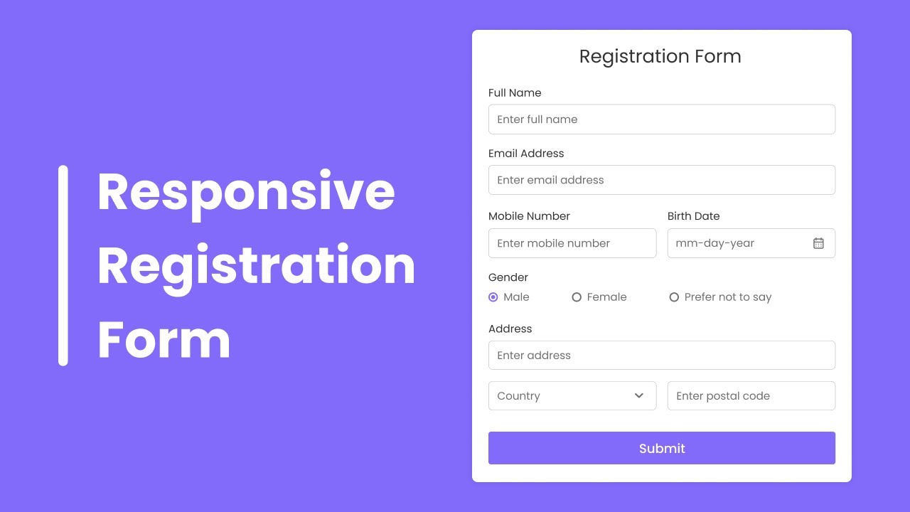
How to Create Responsive Registration Form in HTML & CSS The video tutorial "How to Create Responsive Registration Form in HTML & CSS" teaches you how to create a registration form that looks good on all screen sizes. The video starts by showing you the final result of the form, and then it goes through the steps of creating the form in HTML and CSS.
The first step is to create the basic structure of the form. This includes the headings, the input fields, and the submit button. Once the basic structure is in place, you can start adding the CSS styling. The CSS styling is used to make the form look good and to make it responsive.
The video tutorial covers all of the important aspects of creating a responsive registration form. It shows you how to use CSS to:
Set the width of the form
Center the form on the page
Make the form look good on different screen sizes
Add focus animations to the input fields
The video tutorial also includes the source code for the registration form. This code can be used as a starting point for creating your own responsive registration form.
Here are some of the key takeaways from the video tutorial:
To create a responsive registration form, you need to use CSS to set the width of the form and to make the form look good on different screen sizes.
You can use the @media rule to create different styles for different screen sizes.
You can use the grid-template-columns property to create a responsive form that looks good on both desktop and mobile devices.
You can add focus animations to the input fields to make the form more user-friendly.
Show More Show Less #Web Design & Development
Recommended Videos
How To Automate Your Social Media Posts
https://codingpakistan.com/humix/video/chZ7PFGZPHu
codingpakistan.com
8:08
https://streaming.humix.com/resized-posters/chZ7PFGZPHu/res640.webp
play_arrow
8:08
play_arrow
12:51
play_arrow
19:02
play_arrow
12:26
play_arrow
16:25
play_arrow
7:25
play_arrow
4:03
play_arrow
1:35
play_arrow
8:00
play_arrow
4:10
play_arrow
5:48
1
1:16
Animated login Form using HTML CSS with (source code)
451 views
·
Mar 12, 2023
2
2:02
How To Create Transparent Login Form Using HTML and CSS
718 views
·
Mar 12, 2023
3
1:27
How To Make Login & Registration Form Using HTML, CSS
702 views
·
Mar 12, 2023
4
1:44
Website Design with Login and Registration form HTML & CSS
647 views
·
Mar 12, 2023
5
1:39
How to Create Dynamic island iPhone 14 Animation Using HTML and CSS
182 views
·
Mar 12, 2023
6
1:32
Netflix Clone Website Using HTML CSS with Source Code
639 views
·
Mar 12, 2023
7
2:28
How to Create Age Calculator Using HTML CSS & JavaScript.
4K views
·
Mar 12, 2023
8
1:29
Simple Login Form Using HTML & CSS with (source code)
4K views
·
Mar 12, 2023
9
2:14
How to Create Animated login Form Using HTML and CSS only
492 views
·
Mar 13, 2023
10
1:13
Responsive Menu Using HTML and CSS with (source code)
10K views
·
Mar 13, 2023
11
1:24
Twitter Login Page Design Using HTML CSS with Source Code
2K views
·
Mar 13, 2023
12
1:33
What is HTML ?
5K views
·
Mar 14, 2023
13
2:21
16 Ways to Get Paid to Code Online
5K views
·
Mar 15, 2023
14
1:28
How Can You Make Money With HTML And CSS Only
256 views
·
Mar 15, 2023
15
1:34
How to Make Extra Money Online As A Student
7K views
·
Mar 15, 2023
16
2:57
Best Frontend Frameworks For Web Development Beginners
2K views
·
Apr 6, 2023
17
2:29
Best Way to Learn JavaScript in 2023 (Free and Paid Tutorials)
2K views
·
Apr 7, 2023
18
1:41
32 HTML And CSS Projects For Beginners (With Source Code)
6K views
·
Apr 7, 2023
19
4:08
How to Finish Your Coding Projects Faster? 15 Smart Tips In 2023
1K views
·
Apr 7, 2023
20
3:47
20+ Best Web Development Books For Beginners (In 2023)
353 views
·
Apr 9, 2023
21
2:22
120+ Websites to Learn to Code for Free in 2023 (For Beginners)
28K views
·
Apr 10, 2023
22
2:50
How to Learn CSS Basics the Right Way in 2020: Beginner's Guide
157 views
·
Apr 10, 2023
23
3:02
How to Learn HTML for Beginners in 2023 (With No Experience)
285 views
·
Apr 10, 2023
24
2:48
HTML and CSS Design and Build Websites Review
339 views
·
Apr 10, 2023
25
0:58
Senior vs junior programmer
38 views
·
Apr 11, 2023
26
3:33
27 Best Web Development Courses for Beginners in 2023 (Free and Paid)
7K views
·
Apr 12, 2023
27
1:55
14 Popular Programming Languages and Their Uses Explained
930 views
·
Apr 15, 2023
28
0:55
How To Make Neon Text Hover Effect HTML and CSS
410 views
·
Apr 23, 2023
29
0:58
How To Make Input Animation Html Css
238 views
·
Apr 23, 2023
30
0:51
How To Make Glitch Effect Html Css
143 views
·
Apr 23, 2023
31
0:56
Write HTML and CSS Faster
4K views
·
Jun 28, 2023
32
0:24
#short How to change background colour in HTML ,CSS very easy method 😀😀.
244 views
·
Jun 30, 2023
33
16:19
Home page header section design using HTML and CSS only with source code | ak it expert |
497 views
·
Jun 30, 2023
34
13:08
How to make/create Navbar Very easy method in 2022 | HTML and CSS.
333 views
·
Jun 30, 2023
35
5:28
CSS Text Typing Animation _ Multiple Text Typing Animation
572 views
·
Jul 2, 2023
36
5:29
Windows Preloader using HTML & CSS
235 views
·
Jul 2, 2023
37
1:34
Top 10 Projects For Beginners To Practice HTML and CSS Skills
220 views
·
Jul 6, 2023
38
39:28
How to make a registration form in HTML and CSS || students form very easy
932 views
·
Jul 18, 2023
39
1:49
7 CSS Hacks Every Developer Should Know
1K views
·
Jul 19, 2023
40
1:41
CSS Tricks That Every Web Developer Should Know
8K views
·
Jul 19, 2023
41
11:49
Text to Speech Converter in HTML CSS & JavaScript
5K views
·
Jul 27, 2023
42
12:42
Create a Responsive Calculator in HTML CSS & JavaScript
686 views
·
Jul 27, 2023
43
26:19
Sidebar Menu in HTML CSS & JavaScript Sidebar Dropdown Menu Dashboard Sidebar
251 views
·
Jul 27, 2023
44
34:24
Create Website with Login & Registration Form in HTML CSS & JavaScript
629 views
·
Jul 27, 2023
45
18:22
How to make Pagination in HTML CSS & JavaScript
520 views
·
Jul 27, 2023
46
20:34
Build a Game in HTML CSS & JavaScript
89 views
·
Jul 27, 2023
47
25:32
Build Rock Paper Scissors Game in HTML CSS & JavaScript
318 views
·
Jul 27, 2023
48
8:48
Drag & Drop using HTML CSS & JavaScript
3K views
·
Jul 29, 2023
49
9:32
Double Click Heart Animation in HTML CSS JavaScript Click Animations
70 views
·
Jul 29, 2023
50
10:44
Temperature Converter in HTML CSS JavaScript
531 views
·
Jul 29, 2023
51
19:13
Create Analog Clock in HTML CSS & JavaScript
492 views
·
Jul 29, 2023
52
13:10
Button Click Animation in HTML CSS & JavaScript
526 views
·
Jul 30, 2023
53
19:02
Responsive Login & Registration Form in HTML CSS & JavaScript
108 views
·
Jul 30, 2023
54
8:53
Responsive Card Slider in HTML & CSS
327 views
·
Jul 30, 2023
55
6:02
Neumorphism Loading Spinner in HTML & CSS CSS Animations
43 views
·
Jul 30, 2023
56
19:48
Multi Step Progress Bar in HTML CSS & JavaScript
380 views
·
Jul 30, 2023
21:43
How to Create Responsive Registration Form in HTML & CSS
43 views
·
Jul 31, 2023
58
5:12
How to Create a Google Loader in HTML & CSS _ CSS Animations
17 views
·
Jul 31, 2023
59
11:14
Responsive Full Screen Search Bar in HTML & CSS _ Search Box _ Button Click Animation
390 views
·
Aug 1, 2023
60
16:56
How to Create Responsive Card Slider in HTML CSS & JavaScript _ SwiperJs
249 views
·
Aug 1, 2023
61
12:51
How to make Circular Progress Bar in HTML CSS & JavaScript _ Skills Bar
334 views
·
Aug 3, 2023
62
9:44
Credit Card UI Design in HTML & CSS _ Card Design
809 views
·
Aug 3, 2023
63
21:59
Multiple Options Select Menu in HTML CSS & JavaScript
2K views
·
Aug 4, 2023
64
7:27
Button with Increment and Decrement Number _ HTML CSS and JavaScript
1K views
·
Aug 4, 2023
65
12:22
Download Button with Progress Bar in HTML CSS and JavaScript
628 views
·
Aug 4, 2023
66
18:32
Create Stopwatch Application in HTML CSS and JavaScript
2K views
·
Aug 4, 2023
67
13:22
Create a Card with 3D Flipping Animation in HTML and CSS _ Squid Game Card Design
195 views
·
Aug 4, 2023
68
12:29
Sign up or Registration Form Template in HTML and CSS
1K views
·
Aug 4, 2023
69
17:56
Draggable Circular Navigation Menu in HTML CSS & JavaScript
122 views
·
Aug 4, 2023
70
10:12
How to make Password Show Hide using HTML CSS & JavaScript
73 views
·
Aug 4, 2023
71
12:11
Email Subscription Box Using HTML & CSS _ Newsletter Section
645 views
·
Aug 5, 2023
72
16:45
Responsive Pricing Table using HTML & CSS
323 views
·
Aug 5, 2023
73
10:56
Custom Radio Button in HTML and CSS
1K views
·
Aug 5, 2023
74
9:40
Simple Navigation Bar in HTML and CSS
287 views
·
Aug 5, 2023
75
20:11
How To Create Tab using HTML & CSS _ Vertical Tab Design
2K views
·
Aug 5, 2023
76
14:17
Working Subscribe Button using only HTML & CSS _ Web Push Toast Notification
1K views
·
Aug 5, 2023
77
20:43
Responsive Contact Us Form in HTML And CSS
834 views
·
Aug 5, 2023
78
15:38
How To Copy Text To Clipboard using HTML CSS and JavaScript
2K views
·
Aug 5, 2023
79
13:54
All Hamburger Menu Animation in HTML CSS and JavaScript
343 views
·
Aug 5, 2023
80
12:34
Button with Progress Bar in HTML CSS and JavaScript
519 views
·
Aug 5, 2023
81
12:56
How to Create Sticky Navigation Bar in HTML CSS and JavaScript
525 views
·
Aug 5, 2023
82
15:22
Character Limit using HTML CSS and JavaScript
2K views
·
Aug 5, 2023
83
19:58
How to Create Responsive Navigation Bar With HTML & CSS in Hindi
214 views
·
Aug 9, 2023
84
11:34
Custom Checkbox Design using only HTML & CSS _ Toggle Switch On_Off
1K views
·
Aug 9, 2023
85
10:48
Password Show or Hide Toggle using HTML CSS & JavaScript
445 views
·
Aug 9, 2023
86
19:08
How to Create Login Form in HTML and CSS in Hindi
2K views
·
Aug 9, 2023
87
17:01
How to Create Side Navigation Bar in HTML and CSS
1K views
·
Aug 9, 2023
88
6:19
Gradient Text Effect using only HTML & CSS
123 views
·
Aug 9, 2023
89
8:34
Custom Radio Buttons using only HTML & CSS
1K views
·
Aug 9, 2023
90
15:49
Responsive Login Form using HTML and CSS
116 views
·
Aug 9, 2023
91
19:15
Responsive Profile Cards using HTML and CSS _ Profile Page Design
255 views
·
Aug 9, 2023
92
21:23
How to Create Sidebar in HTML and CSS
160 views
·
Aug 9, 2023
93
15:15
Product Card Design using HTML & CSS
225 views
·
Aug 9, 2023
94
10:32
Share Button Animation Using HTML CSS _ Social Media Button Animation
168 views
·
Aug 9, 2023
95
16:47
How to Create a Simple Website using HTML and CSS
2K views
·
Aug 9, 2023
96
22:09
How to make Sidebar Menu in HTML CSS & JavaScript _ Side Navigation Menu Bar
207 views
·
Aug 13, 2023
97
16:19
How to Make Responsive Profile Card in HTML & CSS
197 views
·
Aug 13, 2023
98
32:10
Make Responsive Todo List App in HTML CSS & JavaScript
318 views
·
Aug 13, 2023
99
14:58
How to Create Popup Modal Box in HTML CSS & JavaScript
9K views
·
Aug 13, 2023
100
17:24
Flipping Card UI Design in HTML & CSS _ Card Hover Animation _ ASMR programming
304 views
·
Aug 13, 2023
101
16:16
ASMR Programming - Custom Range Slider in HTML CSS & JavaScript - No Talking
1K views
·
Aug 13, 2023
102
18:07
Create Random Password Generator in HTML CSS & JavaScript _ Strong Password Generator
10K views
·
Aug 13, 2023
103
25:59
Create a Responsive Navigation Bar with Search Box in HTML CSS & JavaScript _ Responsive Navbar
239 views
·
Aug 13, 2023
104
24:36
Captcha Generator in HTML CSS & JavaScript
10K views
·
Aug 13, 2023
105
18:47
Image Slider in HTML CSS & JavaScript _ Card Slider
2K views
·
Aug 13, 2023
106
32:08
Responsive Login and Signup Form in HTML CSS & JavaScript
29 views
·
Aug 13, 2023
107
37:17
Responsive Sidebar Menu in HTML CSS & JavaScript _ Dark_Light Mode
121 views
·
Aug 13, 2023
108
32:05
Responsive Login and Registration Form in HTML CSS & JavaScript
40 views
·
Aug 13, 2023
109
38:19
Responsive Navigation Bar with HTML CSS & JavaScript _ Dark_Light Mode
629 views
·
Aug 13, 2023
110
20:06
How to make Card Slider in HTML CSS & JavaScript _ Owl Carousel
1K views
·
Aug 13, 2023
111
20:00
How to make Social Media Navigation Buttons in HTML CSS & JavaScript
44 views
·
Aug 13, 2023
112
33:59
How to Validate Email and Password in HTML CSS & JavaScript _ Form Validation
874 views
·
Aug 13, 2023
113
23:11
Responsive FAQ Accordion using HTML CSS and JavaScript
255 views
·
Aug 14, 2023
114
39:21
Create a Website in HTML CSS and JavaScript _ Dark_Light Mode _ Theme Colour Switchers
8K views
·
Aug 14, 2023
115
22:25
Dynamic Digital Clock in HTML CSS and JavaScript _ Light and Dark Theme
355 views
·
Aug 14, 2023
116
33:29
Responsive Login and Registration Form in HTML and CSS
37 views
·
Aug 14, 2023
117
20:39
Email Validation in HTML CSS and JavaScript
2K views
·
Aug 14, 2023
118
27:51
Responsive Video Gallery Lightbox in HTML CSS and JavaScript
4 views
·
Aug 14, 2023
119
30:34
Responsive Image Gallery with Lightbox using HTML CSS & JavaScript
235 views
·
Aug 14, 2023
120
25:13
How to Check & Confirm Password in HTML CSS and JavaScript _ Password Show & Hide _ Input Animations
745 views
·
Aug 14, 2023
121
22:12
How to Make Password Strength Checker in HTML CSS & JavaScript
230 views
·
Aug 14, 2023
122
14:03
Animated Navigation Bar with Indicator using HTML CSS & JavaScript
85 views
·
Aug 14, 2023
123
20:33
Simple Portfolio Website using HTML & CSS _ Website With Typing Text Animation
50 views
·
Aug 19, 2023
124
19:34
Glassmorphism Website Design using HTML & CSS _ Responsive Glass Morphism
20 views
·
Aug 19, 2023
125
23:28
How to Create Responsive Card Slider in only HTML & CSS
55 views
·
Aug 19, 2023
126
40:32
Responsive Dropdown Sidebar Menu using HTML CSS and JavaScript _ Side Navigation Bar
368 views
·
Aug 19, 2023
127
32:59
Responsive Side Navigation Bar in HTML CSS And JavaScript _ Dashboard Sidebar Menu
494 views
·
Aug 19, 2023
128
42:35
Responsive Dropdown Navigation Menu using HTML CSS and JavaScript
550 views
·
Aug 19, 2023
129
28:33
Responsive Website Footer Design using HTML And CSS
999 views
·
Aug 19, 2023
130
26:23
Animated Product Card using HTML CSS and JavaScript
24 views
·
Aug 19, 2023
131
21:14
Responsive Registration Form in HTML & CSS
31 views
·
Aug 21, 2023
132
17:23
Profile Card Design using HTML and CSS
580 views
·
Aug 21, 2023
133
18:39
Responsive Navigation Menu Bar using HTML CSS _ Neumorphism UI
1K views
·
Aug 21, 2023
134
21:48
Create a Login Form with Icon using HTML and CSS
352 views
·
Aug 21, 2023
135
21:03
Neumorphism Side Bar Menu using HTML and CSS
12 views
·
Aug 21, 2023
136
16:25
How To Create Popup Modal Box using HTML & CSS _ Web Push Notification Design
243 views
·
Aug 21, 2023
137
21:43
Responsive Footer using HTML and CSS
470 views
·
Aug 21, 2023
138
17:39
Responsive Contact Us Form In HTML And CSS _ Contact Us Page
369 views
·
Aug 21, 2023
139
7:40
Text Typing Animation On Website Using HTML, CSS And JS _ Auto Typing Effect on Website
3K views
·
Sep 18, 2023
140
9:49
Image Not Showing In HTML CSS Website _ Website Images Not Showing Error Solved
40K views
·
Sep 24, 2023
141
15:13
How To Make A Website With Sliding Text Using HTML And CSS Step By Step
2K views
·
Sep 27, 2023
142
13:11
How To Make Testimonial Slider On Website Using HTML CSS JavaScript
1K views
·
Sep 27, 2023
143
11:45
How To Make Animated Gradient Color Border on Website Using HTML & CSS
6K views
·
Sep 27, 2023
144
8:24
How To Create Neon Style Text In HTML And CSS Website
12K views
·
Sep 27, 2023
145
6:47
How To Make Email Signup Form _ Create Newsletter Subscription Form Using HTML CSS
3K views
·
Sep 27, 2023
146
5:21
How To Add Gradient Color Hover Effect On HTML And CSS Website
2K views
·
Sep 27, 2023
147
12:18
How To Add Icons With Hover Effect On Website Using HTML And CSS
965 views
·
Sep 27, 2023
148
16:53
How To Make Website Using HTML & CSS With Image Gallery _ HTML CSS Website Design
1K views
·
Sep 28, 2023
149
19:15
How To Make Responsive Website Design Using HTML And CSS Step By Step
5K views
·
Sep 28, 2023
150
8:22
How To Make An Image Gallery Using HTML And CSS _ Image Gallery Design With Caption
6K views
·
Sep 29, 2023
151
10:03
How To Make A Website Header Using HTML And CSS Step By Step _ Web Design In HTML & CSS
1K views
·
Sep 29, 2023
152
15:29
How To Make Form (Multi-Step) Using HTML CSS & JS _ Create Form With HTML & CSS
1K views
·
Sep 29, 2023
153
12:27
How To Make eCommerce Website Using HTML And CSS Part 2 _ Online Shopping Website Design
577 views
·
Sep 29, 2023
154
10:24
How To Make Website With HTML And CSS Step By Step Tutorial _ Web Design In HTML & CSS
12K views
·
Sep 29, 2023
155
17:36
How To Make A Responsive Website Design Using HTML And CSS Step By Step Tutorial
2K views
·
Sep 29, 2023
156
21:19
Part 3 Ecommerce Website Design In HTML & CSS _ Create eCommerce Site Product Details Page
2K views
·
Sep 29, 2023
157
13:49
How To Make Image slider With Animation Using HTML And CSS _ Web Design With Animation
7K views
·
Sep 30, 2023
158
11:51
How To Make A Website Using HTML And CSS Step By Step _ Create Website Header
3K views
·
Sep 30, 2023
159
3:59
How To Make Website UI Design In Adobe XD _ Web Designing In Adobe XD
0 views
·
Sep 30, 2023
160
11:33
How To Make Full Screen Menu On HTML And CSS Website _ Web Design Step By Step Tutorial
2K views
·
Sep 30, 2023
161
18:38
How To Make Team Section Design Using HTML And CSS _ Website Design Tutorial Step by Step
3K views
·
Sep 30, 2023
162
29:51
How To Make Website Using HTML, CSS, JS With SVG Animation Step By Step Tutorials
3K views
·
Sep 30, 2023
163
28:27
How To Make Website Using HTML And CSS _ Create HTML & CSS Website Step by Step
9K views
·
Sep 30, 2023
164
16:39
How To Create Touch Slider _ Make Swiper Slider Using HTML CSS & Swiper JS
14K views
·
Sep 30, 2023
165
20:29
How To Build A CV Website
5K views
·
Sep 30, 2023
166
14:03
How To Make A Contact Us Page Using HTML And CSS In 10 Minutes
502 views
·
Sep 30, 2023
167
19:14
How To Make A Website Using HTML And CSS Step By Step _ Website Design Tutorial With HTML CSS
9K views
·
Oct 1, 2023
168
26:04
How To Make Slider In HTML And CSS Website _ Animated Image Slider Design Using HTML CSS
5K views
·
Oct 1, 2023
169
25:46
How To Make Website Using HTML And CSS _ Website Design With CSS Animation Step By Step
3K views
·
Oct 1, 2023
170
17:20
How To Make Tab Layout On Website Using HTML CSS And JavaScript
4K views
·
Oct 1, 2023
171
7:22
How To Create Image Animation Using HTML And CSS _ Border Image Animation On Website
2K views
·
Oct 1, 2023
172
13:21
How To Make Service Section For HTML And CSS Website _ Website Design Service Section Step By Step
7K views
·
Oct 1, 2023
173
20:00
How To Create A Website Using HTML And CSS Step By Step _ Latest Website Design 2020
77 views
·
Oct 1, 2023
174
13:49
How To Make A Team Section On website Using HTML And CSS _ Website Design Tutorial
108 views
·
Oct 1, 2023
175
15:13
How To Make A Website Using HTML And CSS Step By Step _ Website Design With HTML & CSS
552 views
·
Oct 1, 2023
176
11:49
How To Make Range Slider Using HTML and CSS _ Create Slider Selector For HTML CSS Website
193 views
·
Oct 1, 2023
177
19:11
How To Make Website With Animation Using HTML and CSS _ Web Design In HTML CSS
5K views
·
Oct 2, 2023
178
3:50
How To Add 360 Degree Images on HTML Website _ Embed 360° Images On website
548 views
·
Oct 2, 2023
179
8:21
How To Make Image Animation On Website Using HTML And CSS _ CSS Animation Tutorial
29K views
·
Oct 2, 2023
180
19:48
How To Make Website Using HTML And CSS _ Responsive Web Design Tutorial
2K views
·
Oct 2, 2023
181
14:46
How To Create Form With Password Strength Using HTML CSS And jQuery
2K views
·
Oct 2, 2023
182
13:32
How To Make A Website Using HTML And CSS Step by Step _ Website Header Design
4K views
·
Oct 2, 2023
183
10:35
Make Website With Animation _ HTML CSS Jquery Tutorial _ Animation Effect In HTML Website
4K views
·
Oct 2, 2023
184
8:03
How To Create Chart Or Graph On HTML CSS Website _ Google Charts Tutorial
17K views
·
Oct 2, 2023
185
21:02
How To Create A Website Using HTML CSS And Bootstrap _ Latest Website Design
3K views
·
Oct 3, 2023
186
15:38
How To Make Image Gallery For Website Using HTML CSS And JavaScript
4K views
·
Oct 3, 2023
187
54:44
How To Make Website Using HTML CSS Bootstrap Complete Website Design
5K views
·
Oct 3, 2023
188
21:19
How To Make A Website Using HTML And CSS _ Website Design In HTML And CSS
10K views
·
Oct 3, 2023
189
36:45
How To Make An Ecommerce Website With WordPress Free Theme
2K views
·
Oct 3, 2023
190
9:02
How To Create Table In HTML And CSS _ HTML Website Tutorials
1K views
·
Oct 3, 2023
191
13:57
How To Make Website Using HTML And CSS Step By Step _ HTML Website Tutorial
1K views
·
Oct 3, 2023
192
13:39
How To Make Website Uisng HTML And CSS _ Create A Website Step By Step
998 views
·
Oct 3, 2023
193
10:14
How To Make Animated Image Slider In Website Using HTML CSS And Bootstrap
4K views
·
Oct 4, 2023
194
12:04
How To Add Stylish Fonts In HTML And CSS Website _ Google Fonts Tutorial
42K views
·
Oct 4, 2023
195
14:37
How To Add Video Popup In Website Using HTML CSS Bootstrap _ Add Video On HTML Website Pop-up
13K views
·
Oct 4, 2023
196
10:36
How To Make Signup Form Using HTML And CSS _ Create Sign Up Form In HTML CSS
2K views
·
Oct 4, 2023
197
11:15
How To Make Typing Effect In HTML CSS Website _ Dynamic Using Typed JS
332 views
·
Oct 4, 2023
198
10:05
How To Make Card View Blog Section In HTML CSS And Bootstrap _ Web Design Tutorial
16 views
·
Oct 4, 2023
199
12:15
How To Make Online Payment UI Design Using HTML And CSS _ HTML CSS Tutorials
94 views
·
Oct 4, 2023
200
8:19
How To Make Image Gallery _ Image Portfolio In HTML CSS JS Lightbox
22 views
·
Oct 4, 2023
201
6:14
How To Make Floating Social Media Icons on Website Using HTML And CSS _ Sticky Social Buttons
57 views
·
Oct 4, 2023
202
16:26
How To Make Website Using HTML And CSS Step By Step Website Development Tutorial
1K views
·
Oct 4, 2023
203
12:18
How To Make Mobile Wallet UI Using HTML CSS _ E-Wallet App UI Design
30 views
·
Oct 4, 2023
204
20:33
How To Make Message Box Using HTML And CSS _ Messenger Design In HTML CSS
172 views
·
Oct 5, 2023
205
10:05
13 Amazing CSS Image Hover Effect And Transition _ HTML CSS JS _ Web Design Inspiration
258 views
·
Oct 5, 2023
206
16:35
How To Make Latest Google Chrome Page Design In HTML, CSS And Bootstrap
893 views
·
Oct 5, 2023
207
13:28
How To Make Registration Page Using HTML And CSS _ Login Registration Form Design
392 views
·
Oct 5, 2023
208
19:30
How To Make Music App Design Using HTML And CSS Bootstrap _ HTML CSS Tutorial
56 views
·
Oct 5, 2023
209
20:54
How To Create Music App Design In HTML And CSS _ Music Track List Page Design
61 views
·
Oct 5, 2023
210
11:35
How To Make Profile Card In HTML And CSS _ User Profile UI Design Using HTML CSS
252 views
·
Oct 5, 2023
211
12:18
How To Make Soial Media Buttons In HTML And CSS _ Social Media Icons Design
46 views
·
Oct 5, 2023
212
10:52
How To Make Website Testimonials Section Using HTML CSS And Bootstrap
46 views
·
Oct 5, 2023
213
10:26
How To Make Website Services Section Using HTML CSS And Bootstrap
88 views
·
Oct 5, 2023
214
17:34
How To Make Website Pricing Plan Section In HTML CSS And Bootstrap
17 views
·
Oct 5, 2023
215
12:22
How To Make Website Team Member Section Using HTML CSS And Bootstrap
133 views
·
Oct 5, 2023
216
15:19
How To Make Signup Page Like Instagram In HTML CSS Bootstrap _ Login Form Design
81 views
·
Oct 5, 2023
217
6:08
Parallax Effect HTML CSS In Just 5 Minutes _ Parallax Scrolling Tutorials
109 views
·
Oct 6, 2023
218
4:51
CSS 3D Layer Image Hover Effect HTML And CSS Tutorial _ 3D Layered Design CSS
28 views
·
Oct 6, 2023
219
4:36
CSS Toggle Switch _ On Off Button Design Using HTML And CSS _ 4 Minutes Tutorial
227 views
·
Oct 6, 2023
220
8:54
How To Make 3D Buttons Using HTML CSS _ HTML & CSS Website Tutorials
85 views
·
Oct 6, 2023
221
11:43
How To Make Website Using HTML, CSS And Bootstrap _ Landing Page Website
2K views
·
Oct 6, 2023
222
6:10
How To Make A Search Box Using HTML And CSS In 5 Minutes
5 views
·
Oct 6, 2023
223
19:23
How To Create Responsive Menu In HTML And CSS _ HTML Website Tutorial
379 views
·
Oct 6, 2023
224
14:31
How To Make Website _ Moving Particles With HTML CSS Particles JS
668 views
·
Oct 6, 2023
225
18:17
How To Create Signup Form In HTML And CSS _ Registration From _ Social Login
2K views
·
Oct 6, 2023
226
14:15
How To Create Website Using HTML CSS Bootstrap _ Responsive Website Tutorial
8K views
·
Oct 6, 2023
227
18:20
Create Working Contact Form Using HTML, CSS, PHP _ Contact Form Design
2K views
·
Oct 7, 2023
228
14:40
How to make Video playlist using HTML,CSS & JAVASCRIPT
401 views
·
Jan 29, 2024
229
12:55
How to Make an Active Nav Link On Scroll using HTML, CSS & JavaScript
340 views
·
Jan 29, 2024
230
15:24
Upload and Preview Image Using HTML,CSS & JavaScript
649 views
·
Jan 29, 2024
231
7:43
Sticky Navigation On Scroll bar using HTML CSS & JavaScript
2K views
·
Jan 29, 2024
232
16:14
Build Your Own Add to Cart with HTML & CSS __ Front end
33 views
·
Jan 29, 2024
233
14:01
Password Show and Hide using HTML CSS & JavaScript #animation
1K views
·
Jan 29, 2024
234
17:58
Movie Card With Hover Effect Using HTML & CSS.
1K views
·
Jan 29, 2024
235
19:46
Animated Profile Card Design using HTML & CSS
1K views
·
Jan 29, 2024
236
13:45
To Do List using HTML , CSS & JavaScript
145 views
·
Jan 29, 2024
237
13:53
Pagination using HTML,CSS & JavaScript
2K views
·
Jan 29, 2024
238
14:22
Custom Image Slider using HTML, CSS & JavaScript
615 views
·
Jan 29, 2024
239
8:01
Simple Navigation Menu Bar __ Navigation bar using HTML CSS & JavaScript
5K views
·
Jan 29, 2024
240
9:47
Color Flipper using HTML, CSS & JavaScript
14K views
·
Jan 29, 2024
241
11:30
Custom List Filter using JavaScript __ Search Filter
2K views
·
Jan 29, 2024
242
7:03
Skeleton Loading Effect Animation Using JavaScript __ Part 2
355 views
·
Jan 29, 2024
243
6:51
Typing Text Animation Effect using HTML,CSS & JavaScript
274 views
·
Jan 29, 2024
244
11:33
Input Animation Using HTML & CSS __ Login Form
61 views
·
Jan 29, 2024
245
9:14
Pulsing Heart Animation using HTML,CSS & JavaScript
1K views
·
Jan 29, 2024
246
18:10
How to make Simple Website using HTML & CSS
111 views
·
Jan 29, 2024
247
18:09
Build Your Own Music Player with HTML, CSS, and JavaScript
88 views
·
Jan 29, 2024
248
6:09
Awesome Border Animation Effect using CSS
97 views
·
Jan 29, 2024
249
9:38
Create Mind-Blowing Animated Pop-Ups with HTML CSS JavaScript
441 views
·
Jan 29, 2024
250
11:33
Create a Hamburger Icon using HTML & CSS only
116 views
·
Jan 29, 2024
251
8:13
Neon Glowing Button hover using HTML & CSS.
146 views
·
Jan 29, 2024
252
14:50
Glassmorphism Clock with HTML CSS & JavaScript
118 views
·
Jan 29, 2024
253
10:23
Awesome Image Slider using HTML,CSS & JavaScript.
960 views
·
Jan 29, 2024
254
18:24
Amazing Fingerprint Effect using HTML & CSS
563 views
·
Jan 29, 2024
255
14:01
Drowdown Menu using CSS & JavaScript.
380 views
·
Jan 29, 2024
256
14:31
Simple Login form using CSS only
824 views
·
Jan 29, 2024
257
8:39
Amazing Text Hover Effect using JavaScript.
301 views
·
Jan 29, 2024
258
7:02
Image Loading Blur Effect using HTML,CSS & JavaScript.
697 views
·
Jan 29, 2024
259
10:10
Create Stunning Image Gallery with HTML, CSS & JavaScript
1K views
·
Jan 29, 2024
260
12:51
3D Social Media Icons Hover using CSS
14 views
·
Jan 29, 2024
261
5:19
Text Hover Effect using CSS & JavaScript.
2K views
·
Jan 29, 2024
262
7:33
How to Build a Character Counter Using HTML, CSS, and JavaScript
68 views
·
Jan 29, 2024
263
7:11
Amazing Button Hover Effect using CSS.
3K views
·
Jan 29, 2024
264
20:06
Neumorphism Analog Clock Tutorial using HTML, CSS, JavaScript.
2K views
·
Jan 29, 2024
265
7:52
Amazing Text Animation Effect using HTML & CSS only.
292 views
·
Jan 29, 2024
266
17:28
Animated Profile Card Design using HTML & CSS.
470 views
·
Jan 29, 2024
267
7:27
Image Password Strength using JavaScript
28 views
·
Jan 29, 2024
268
13:20
Animated Toast Notification with Progress Bar in HTML,CSS & javaScript
118 views
·
Jan 29, 2024
269
7:03
Navigation Menu indicator using HTML CSS & JavaScript
2K views
·
Jan 29, 2024
270
5:07
Border Animation Effect _ Quick css - Animated Border Cards
251 views
·
Jan 29, 2024

